SOLVING PROBLEMS
Defining the Problem
For Greener Day Toys, the true client problem faced was differentiating the brand from competitors by showing uniqueness through cohesive design to attract the target audience. For a brand to be successful in its market category, it needs to stand out amongst its competitors. One way for a brand to differentiate itself from others is by creating an onlyness statement (Scanlon, 2006). In doing so, try to be as unique as possible to create differentiation to avoid competition from similar brands (Neumeier, 2015).
Creating an Onlyness Statement
By using the brand profile, components for the brand were identified and defined, including but not limited to the market category, needs, benefits and features, location, and target audience. Utilizing Neumeier’s Onlyness Statement checkpoints explained by Argo (2021) and further discovered through a secondary source, the first draft of the Onlyness Statement was written.
However, it was vague in certain spots, listing the location as “world wide web” and focusing the psychographics/demographics solely on the parent’s characteristics. So, a second draft was created to add a few distinct characterizations, such as that the company is “independently owned”, can be found “online”, and markets to the “young children” of the target parents listed.
Building Brand Personality
The next step was to build the brand personality. According to Trump and Newman (2021), customers are more apt to respond to brand personalities that are positive and will heal emotions of boredom and unpleasantness. Keeping this in mind, the focus was placed on highlighting the features Greener Day Toys offers to customers as to what is received when making a purchase, and a positioning statement was made. When writing the positioning statement, the goal was to focus on how easy it is for a working parent of a young child, who is busy and burnt out, to be able to order a product from Greener Day Toys. Adding a few of the benefits the brand offers, such as being inexpensive and made from recycled materials, were placed throughout the statement in the hopes of attracting the target audience.
As well, taglines were brainstormed and created. In the 2.3 Research, Rogalle (2021) states that a tagline is the “essence of the brand”, and should emphasize the brand, while also stating what the customer is getting. Likewise, in a book on brand strategies, the authors suggest the 3 M’s for writing taglines: meaningful, motivating, and memorable (Kiddon et al, 2012). Taking this into consideration, the tagline options were written to draw attention to the product’s educational and eco-friendly values, allowing customers to see how the product would benefit them.
The Look and Feel
To further build the brand personality, emphasis was put on creating cohesion for the look and feel of the brand. When choosing the typography for the heading, subheading, and body copy, the idea was to keep with the theme of children’s toys while also considering the eco-friendly element. The font chosen for the subheadings and callouts was Prater Block Pro, a fun and bold block lettering type. Staying in the same type family, Prater Sans Pro Bold was chosen for headings, and Prater Sans Pro Regular for body style, having a more playful look to symbolize the creative aspect of the product being geared towards children.

Prater Block Pro
Gremillion (2019) writes that it is important to understand the psychological impact colors have on a target audience. So, for the color palette, the thought process was to stay with colors found in nature but also seen in children’s education, specifically green and orange.
Chapman (2021) offers that green represents stability and is associated with growth and nature. This statement resonated in that growth would be happening not only with the child using the educational toy product but also within the elements used to make the products.
Chapman (2021) also states that orange is strongly associated with creativity. Since the final tagline chosen was “naturally engaging”, it only made sense to use orange as one of the primary colors to inspire creativity in engagement with the product.
The secondary palette colors chosen were shades of the primary colors yellow and blue, also adding brown to really put an emphasis on the naturalness of the products.
Next, lines, shapes, textures, and patterns were picked to represent the brand’s look and feel. With an emphasis on nature, most of these consisted of curved lines, green circles and leaves, and wooden textures and blocks. In defining the look and feel of Greener Day Toys, the option to focus on the brand’s eco-friendly values was the driving force.

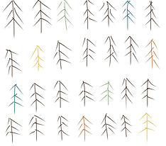
The next step in brand development was to create a logo. Sketches were designed and heavily influenced by the creative and environmental aspects of the brand. In the 2.2 Lecture, Baldowski (2021) states that the designer is to “add a representative symbol to the overall brand visual identity in a way that will best represent the brand, product, or service.” So, many of the logo sketches developed consisted of toy block shapes and leaf symbols. Multiple brainstorming sessions occurred, and many changes were made to the logo sketches before the options were narrowed down to three top choices, then eventually one primary selection.


Brand Cohesion
Ultimately, after everything was decided and designed, there was a struggle with brand cohesion and differentiation from competitors. Also, the look and feel characteristics did not properly reflect the brand values. Some of the designs focused solely on the educational aspect the brand offers, while others relied heavily on the natural and environmental benefits.

Ostrom (2022) offers that to create brand cohesion, you must first define brand positioning. Once that is discovered, one can move on to discovering the brand identity. So, brainstorming and mind mapping was done for different ideas, and sketching multiple options for a new logo, typography, lines and patterns, and a revised color palette.


Original Brand Vision Board
New characteristics were put into place, and the designs were updated. The brand vision board was recreated with a new color palette, typography, and logo.

Revised Brand Vision Board
Still focusing on the natural qualities of the brand, as well as the engaging educational values, the decision was made to use hand-drawn designs for the logo and patterns/lines. While the thought of hand-drawing a complete typeface for headings was considered, eventually that idea was scrapped, and Providence Sans Pro was used again for its qualities of looking like children’s handwriting. Finally, the brand cohesion felt strong, and the hand-drawn quality of the designs offered uniqueness to the brand to make it stand out to the target audience.
Hand-drawn pattern
for backgrounds

Hand-drawn pattern
for backgrounds

New, hand-drawn logo
References
Argo, B. (2021). 1.2 Lecture: Onlyness Statement. Retrieved from Full Sail One: https://online.fullsail.edu/class_sections/154727/modules/507394/activities/2981171
Baldowski, A. (2021). 2.2 Lecture - Deisgn Evaluation. Retrieved from Full Sail One: https://online.fulsail.edu/class_sections/154728/modules/517163/activities/3035565
Chapman, C. (2021, May 20). Color Theory for Designers, Part 1: The Meaning of Color. Retrieved from Smashing Magazine: https://www.smashingmagazine.com/2010/01/color-theory-for-designers-part-1-the-meaning-of-color/
Gremillion, A. (2019). Colors and emotions: how colors make you feel. Retrieved from 99 designs:
https://99designs.com/blog/tips/how-color-impacts-emotions-and-behaviors/
Kiddon, J., Light, L., Till, B. D., Heckler, D., Mathews, R. D., Hall, R., & Wacker, W. (2012, March). Brand Strategies for Success (Collection): Chapter 39: Truth - The three M's of Taglines: Meaningful, motivating, memorable. Retrieved from O'Reilly Learning:
Neumeier, M. (2015, July). The Brand Flip: Why customers now run companies and how to profit from it. Retrieved from O'Reilly Learning:
https://learning.oreilly.com/library/view/the-brand-flip/9780134173009/
Ostrom, C. (2022, March 26). How to Create A Cohesive Brand Identity, Personality, Voice, Story, Name, And Promise. Retrieved from Map and Fire: https://mapandfire.com/blog/how-to-create-a-cohesive-brand-identity-personality-voice-story-name-and-promise/
Rogalle, E. (2021). 2.3 Research: Taglines. Retrieved from Full Sail One: https://online.fullsail.edu/class_sections/154727/modules/507395/activities/2981179
Scanlon, J. (2006). The Onliness of Strong Brands. BusinessWeek Online, 24.
Trump, R. K., & Newman, K. P. (2021, June). Emotion regulation in the marketplace: the role of pleasant brand personalities. Marketing Letters 32(2), 231-245. Retrieved from Ebsco Host.